I’ve posted several times about how much I love going to The Westmoreland. It’s not fair to it to say it’s a wonderful museum for the size of our area – because it’s just flat out a wonderful museum, period.
I had the chance to visit again over the weekend, and I’m truly impressed with the steps they’re taking to keep everyone safe. Add this in to great works and a friendly, knowledgable staff, and you can’t go wrong with a visit – whether you’ve got an hour or four.
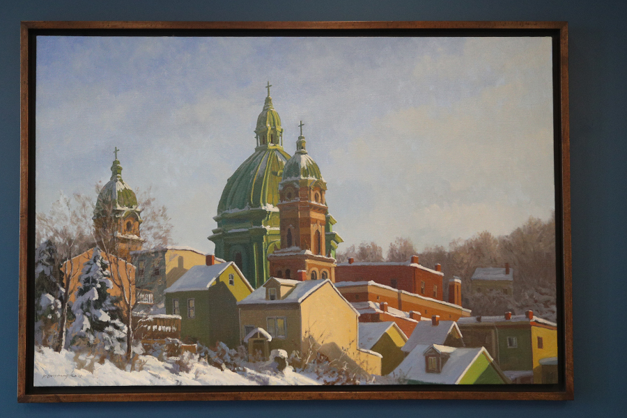
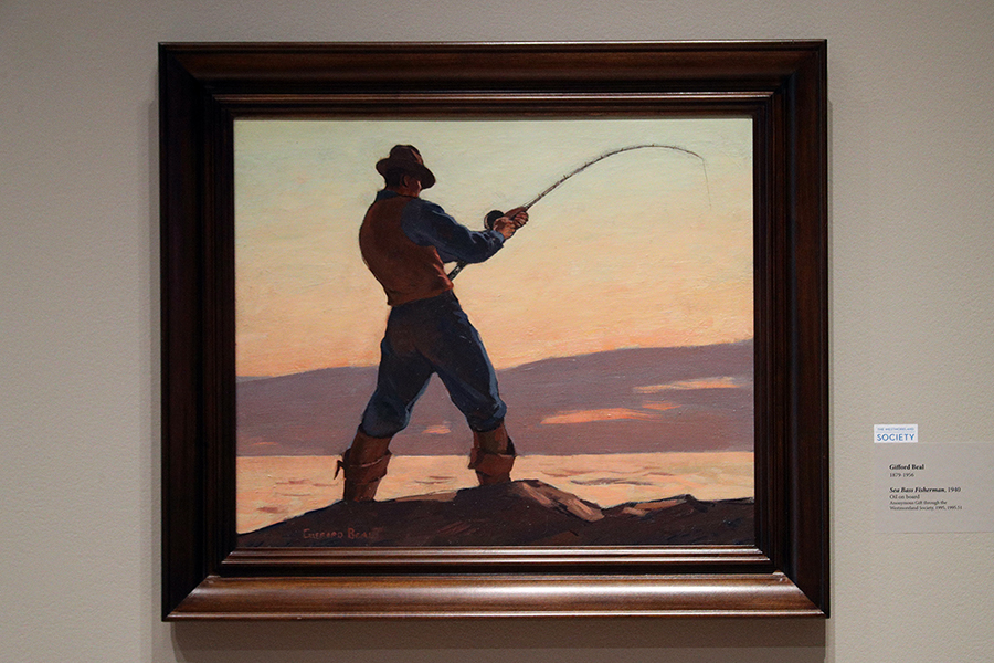
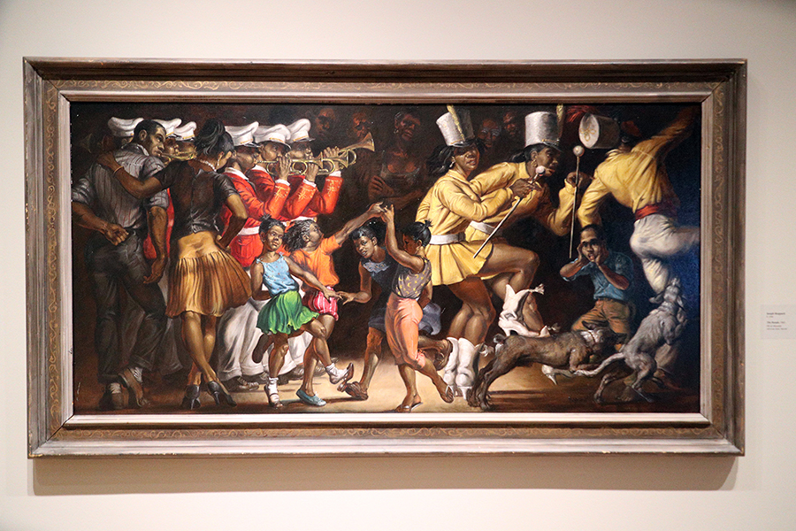
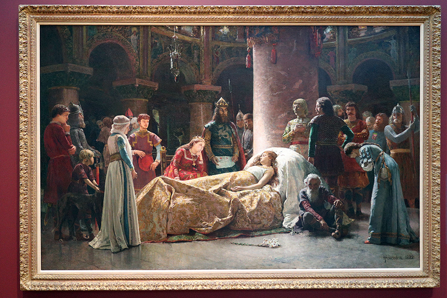
The following are just some of the pieces that caught my eye this visit.
This is one of the first pieces you’ll see as you enter The Westmoreland – and what a wonderful way to start things off, promising wonderful pieces to come.


I’ve always loved this piece above, but its placement now, behind the sculpture, is just absolutely perfect. They work so well together, in my opinion.


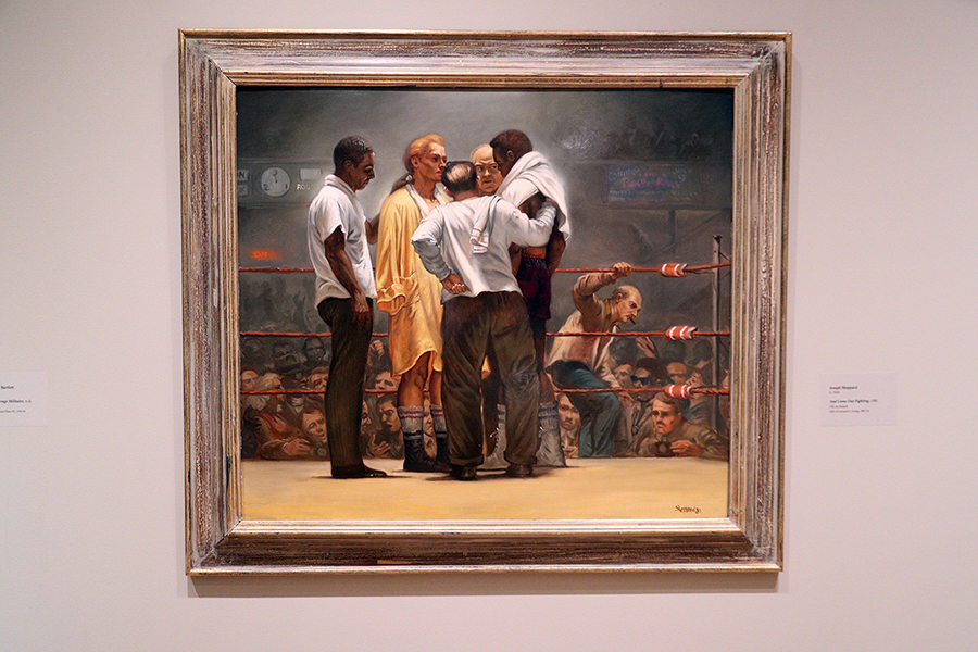
There is just so much going on with this piece – I could look at it for an hour and feel like I still haven’t even seen it all. In that way, it reminds me of how I feel when I look at this one below – there’s just so much to digest. I’m not sure that they could be more different, but the way they each pack such a wallop into the frame, and how they both use light so incredibly well is just flat out impressive.

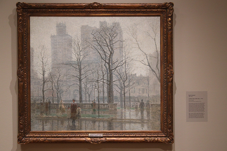
Speaking of using light, I am in awe of the two below – the second is also one of my faves and has been since the early 90s, when I first went to the Museum. I love, love, love the mood created in both of these.


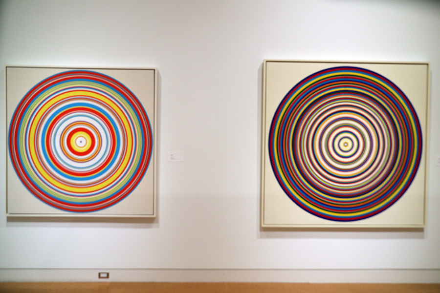
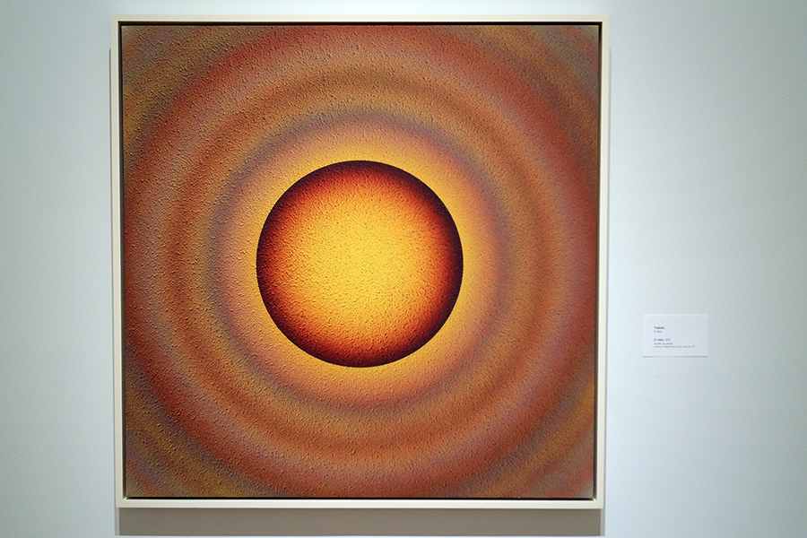
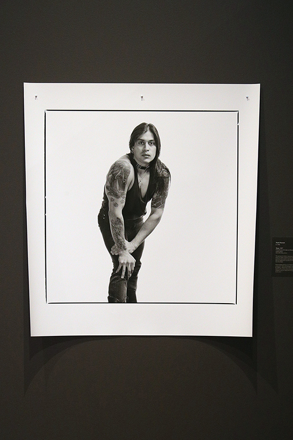
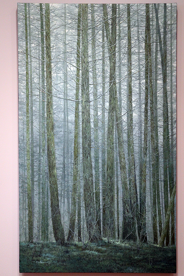
These are the types of pieces that I’m not sure get enough credit. While they may seem to be simple in nature, they are actually so incredibly complex, and I’m not sure that it makes complete sense unless you’re standing in front of them. Precise doesn’t even come close enough to describing them.

One of the things that I truly value in The Westmoreland is the diversity presented throughout. It’s a Museum of American Art, and that can be seen throughout.


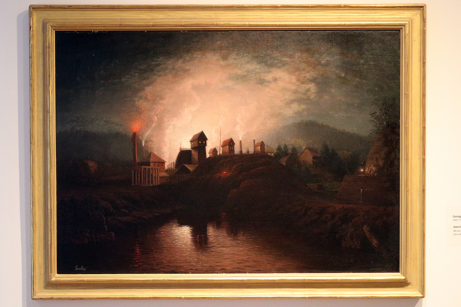
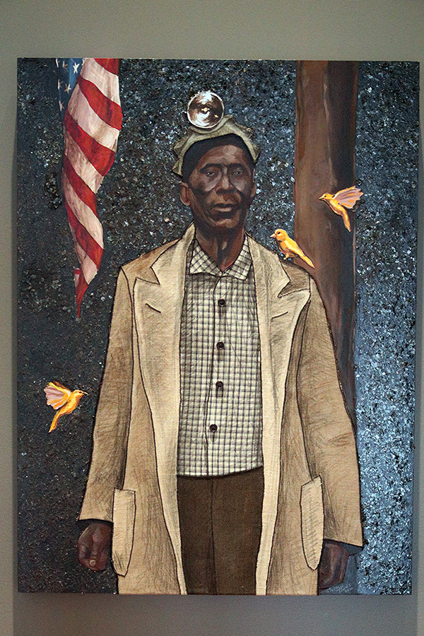
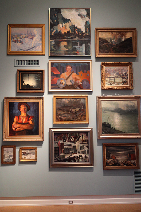
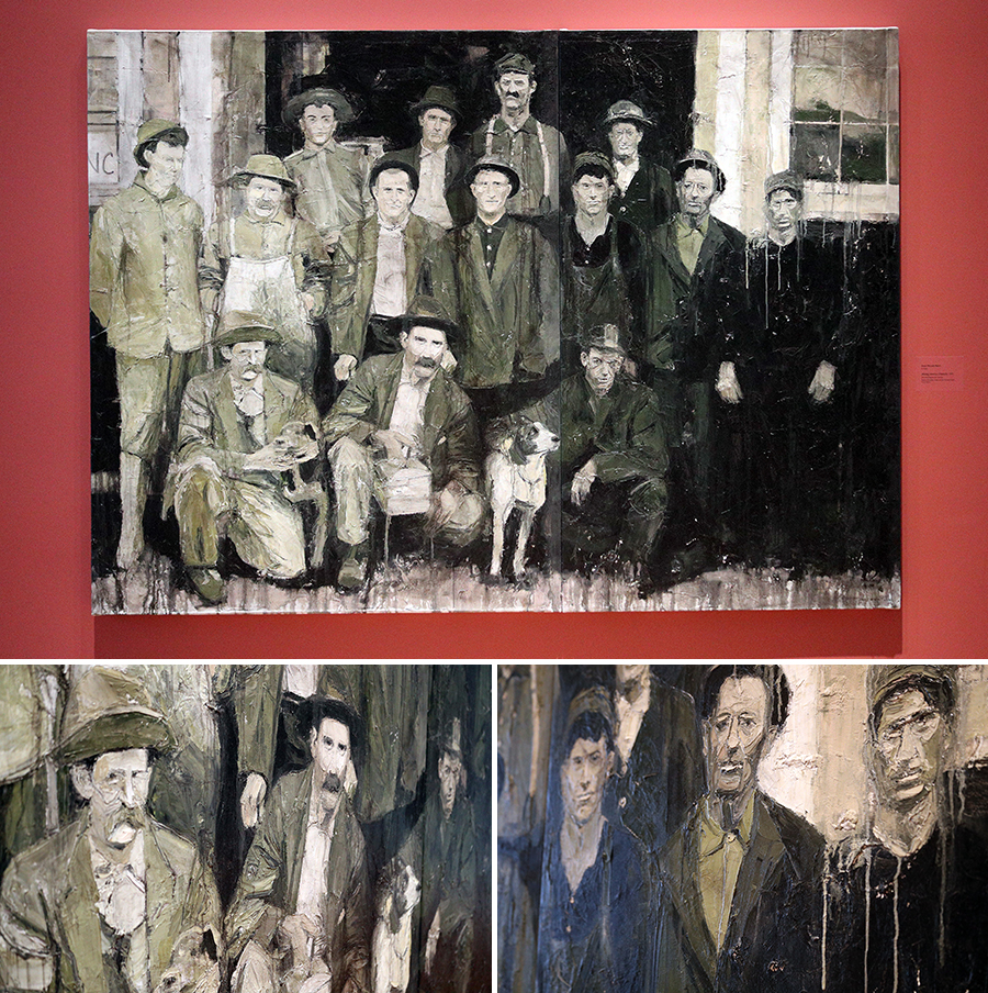
I’m thankful that pieces from the Born of Fire exhibit from, what? 10 years ago? have maintained their place in The Westmoreland. They encapsulate the working men and women of our area so incredibly well. Their placement on this wall is spectacular as well.

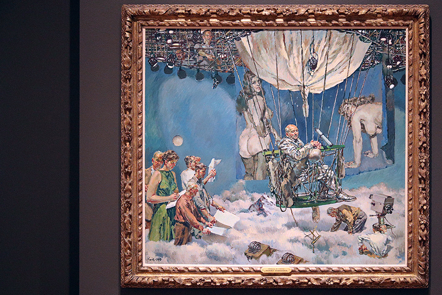
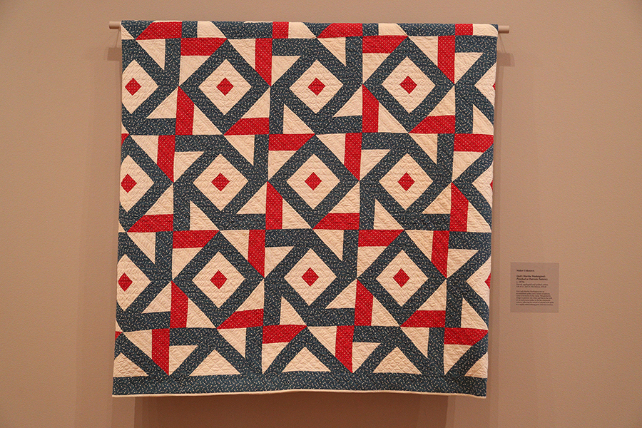
This is another one that I can look at for quite some time – the details are just so awesome.

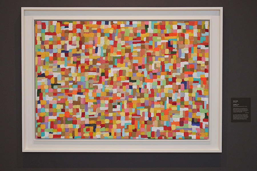
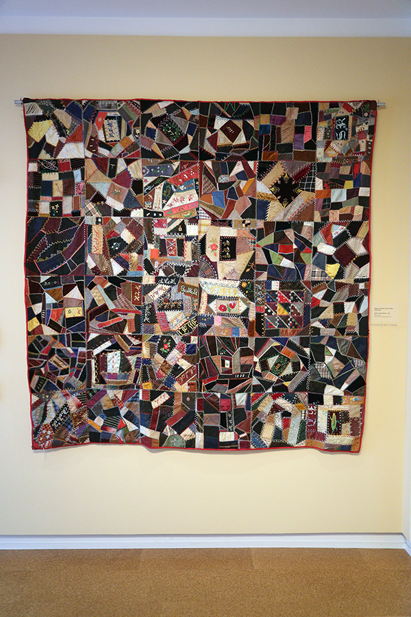
Speaking of details – at first this might not look like it fits that description, but, man, it’s just loaded. The colors just jump at you.

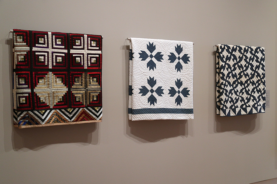
We studied Alice Walker’s “Everyday Use” in class this past week – and beyond examining what a quilt symbolizes to a family, we looked, specifically, at some pieces hanging in the Smithsonian Museum of American Art. It was wonderful to see some beautiful quilts hanging in The Westmoreland as well.


I recently read Kristin Hannah’s The Four Winds, which is set in the Dust Bowl era – I couldn’t help thinking about how hard those men and women worked to survive. While this isn’t from that area, it definitely gave me that vibe. I tried to get a couple close ups so you can see just how much depth is in this piece. I also love how the paint just drips down in places, symbolizing – to me – that they’re all just completely worn down in every facet of their lives.

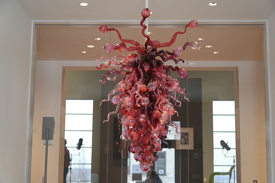
As The Westmoreland is set up currently, this is one of the last pieces you’ll see – and what a way to close a visit. This Dale Chihuly piece just jumps at you and I see something different every time I see it.

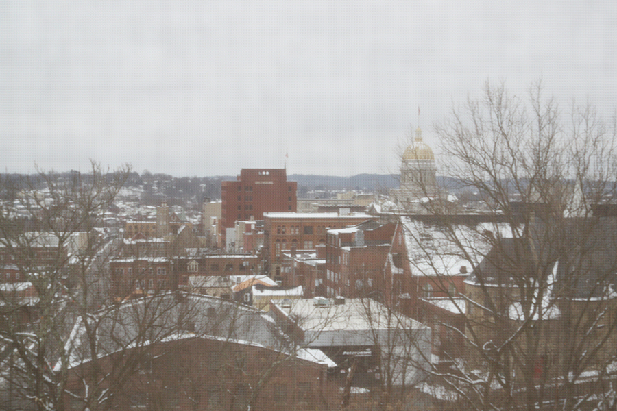
Lastly, this picture doesn’t even come close to doing this view justice, as it’s taken through a darkened screen – but it does give you a taste of the current view from the windows of the cantilevered gallery.

I just want to emphasize that these weren’t done with any promotion in mind – other than hoping you check out The Westmoreland at some point – you won’t be disappointed.


